31 January 2010

The Mistral II (+interview!)

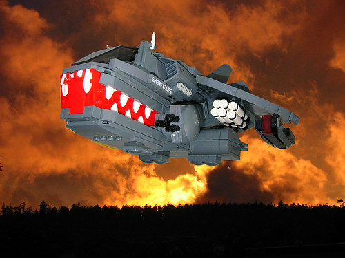
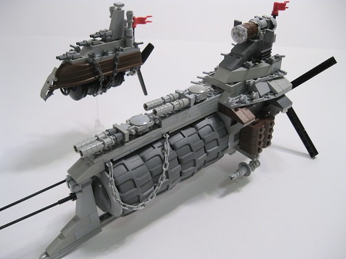
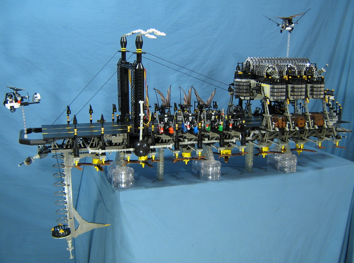
One of the most popular MOCs this week is the Mistral II - a massive flying Steampunk ship drawing inspiration from the Eiffel Tower. It's Nathan Proudlove's remake of his original 2006 creation The Mistral. So sit back, and enjoy the pictures whilst reading a short interview I took with Nathan...


John: The Mistral II is the second version of the Mistral, the first version of which was made a few years ago. What gave you the inspiration to remake such an old project, and why now?
Nathan Proudlove: I decided to remake the Mistral on the way home from a show in which it had been displayed. Mistral I was packed loosely in a box in the back seat of my car, (I didn't have very far to drive) when I heard a sickening sound from behind me at a stoplight. The ship had completely disintegrated! I had only had the thing completed for two weeks when it just ceased to be. Structural integrity wasn't exactly a priority with the first one. So I knew it would have to be rebuilt eventually, I just wasn't sure when.

J: This second version is very different to the first, yet keeps some of the unique features. How did you go about redesigning the Mistral I? Did you start from scratch again?

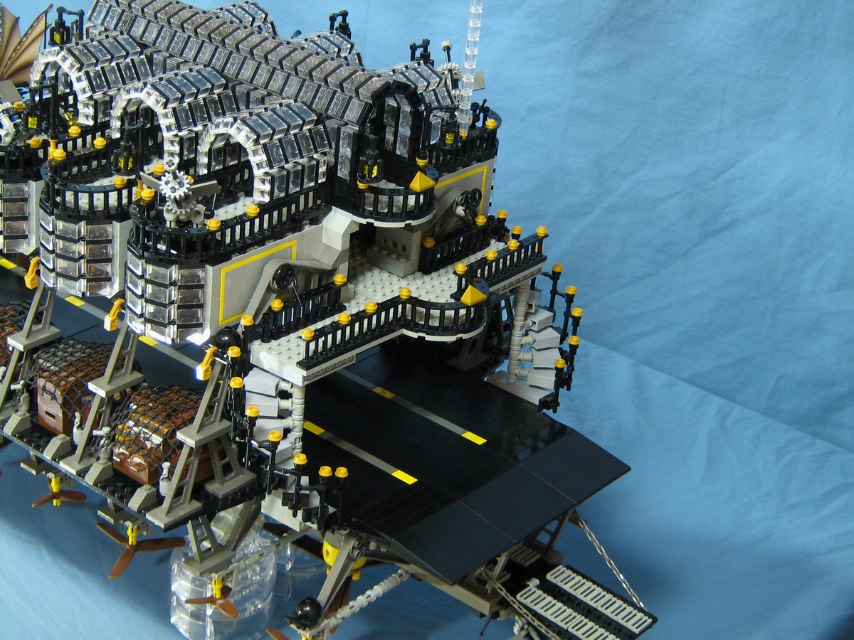
NP: The rope bridges that I had used for trusswork on the original were actually loaned to me by a friend, so when I returned them, I knew I had to come up with something different for the new version. The idea came while sorting, as it so often does, to use the dozens of dark grey struts and large Insectoid legs I had collected, to loosely replicate the iron work in the Eiffel tower as the base of the Mistral II. The command structure above the deck went through many redesigns, and I consulted with a few of my steampunk peers along the way. They gave good solid critique along the way and got me to pay attention to detail in areas I might have otherwise missed.


J: The Mistral II is clearly a Steampunk creation. Did you use any Steampunk pictures or concept art for inspiration? For example, what gave you the idea for the glass house?
NP: The concept for the first version of the Mistral was mostly inspired by the flying aircraft carrier in the film Sky Captain and the World of Tomorrow. The design of the ship itself was almost exclusively mine though. I simply imagined what a flying aircraft carrier would look like if it were placed in a steampunk setting. The Mistral II, however, took many more design cues from specific sources. I've already mentioned the Eiffel Tower, and the Palais d'Industrie from the Paris World's Fair in 1855 is the source for the glass dome. Mistral II was designed to be elegant, refined and symmetrical, qualities of which the first Mistral possesed none.

Well there you go: anything you ever needed to know about the Mistral! Many thanks to Nathan to answering my questions. I'll [hopefully] see you next week for another interview!


~John


30 January 2010

No words needed.

Or at least, not in Spastik Chuwawa's latest Brickfilm, Snob on a Pogo Stick. It's quick, it's witty, it features some great animation techniques and, best of all: you can see pictures of the set on Flickr. What's not to like?


~John

27 January 2010

REAL Collectable Minifigure pictures!


As the saying goes, pictures speak louder than words... and so I leave you with this first ever non-render picture of the collectable minifigures to be available in newsagents or somewhere-like-that this June.


Images courtesy of good ol' Dano courtesy of Pocket-Lint. See close ups of the minifigs:


~John

26 January 2010

You Could Say I've Fallen A Little Behind


Hopefully a few of these new creations by fellow Flickr users will cheer you all up. Or at least keep you interested in these posts that I make. It seems like John's getting all the attention which is understandable since he posts so much. Anyway lets see if I can deter a little attention my way.
Anyway the first one lined up is by fantastic Pirate builder Derfel Cadarn and this MOC is more than up to par with his usual. The concept is great and the rock work is just as nice. Great work Derfel Cardarn.

Redcoat Rum Runners!, originally uploaded by - Derfel Cadarn -.

Next we have this cool Snow Cat by ltwp formally Gladius on Flickr. This creation sports some great techniques and just looks so adorable. I've always been a sucker for a well designed model, in fact I prefer them most times over dios and this creation is no exception.

Snow Cat, originally uploaded by _ltwp.

Last we've go another pirate creation by Flickr user Sir Regonold who seems to often take a lot of inspiration from building Sir Nadroj, but this very original creation is great sporting a very popular (as far as Flickr comments are concerned).

Colonial Town Center, originally uploaded by Sir Regonold.


Huff, huff. Well that's a line-up now hopefully from now on I won't have to catch-up.

Make Way...


Robot Tune Up Lab, originally uploaded by V&A Steamworks.
This new Robot Tune Up Lab by Flickr user V&A SteamWorks (Guy Himber) is coming through with another one of his prevailing steam powered creations and I think this one is just marvelous. The backdrop is well detailed and the mechbot is just as cool. Nice work Guy!

24 January 2010

You build what now?


Say hello to the first ever 'teaser trailer' for a Lego series. It's for the Bionicle successors, Hero Factory.


~John

21 January 2010

8-Bit Trip


I just couldn't resist posting this amazing Brickfilm - the animation in it is truly fantastic. Usually, I find Lego 'sculpture animations' - with shapeshipting forms made from Lego bricks - quite dull, and a lot of them are badly made.
This one, however, is the complete opposite. Taking 1500 hours to make, it's a feat of animation. I love the paddle-game scene and the cube part is especially well-animated. Unfortunately the 'Lego-ised' real footage is hard to make out, and the music is only just bearable, but maybe just watch in on mute if you really don't like the soundtrack. Either way, watch this film!


~John

20 January 2010

MUJI + LEGO


Remember when I blogged about the new MUJI+Lego sets which combined paper crafts with Lego? Well,  Flickr user Ateliers Kazu.Raitu has bought two of the sets, and posted images on his photostream. Let's take a look at what the sets are like inside...

The box of this set shows the series' best model: some sort of strange dragon made with lots of different pieces of card to create a fluffy body. Apart from the obvious layout and graphic design differences, the box seems similar to a normal Lego box.

The box contains card with pre-punched holes, as well as a small instruction manual (or 'ideas book' as they used to call it in the Creator line). It seems like you have to cut out the shapes yourself... not the best idea, as people could always cut it out wrong and it will almost always look roughly cut, and not perfect. Then again, keeping the templates blank means people can make whatever shapes they like. It's only an ideas book, after all. I'd rather have both pre-cut templates AND blank sheets.

Here you can see the dragon-like creation. It's quite a clever design, using the bracket to connect the head to the body.

I really like this peacock. Whether it's the Flickr user's very own design, or one included in the 'idea book' I don't know. I only wish there were more Lego in it - it seems as if the Lego pieces are just used as fasteners for the card, not part of the actual shape itself.

There's also a cute little crab. Yay!

Ateliers Kazu.Raitu also bought something which we weren't shown in the Design Milk post - A specialised MUJI+Lego holepunch, which punches stud-sized holes. At least it saves you on buying more and more of the actual sets. To be honest, I like accessories. If this line is ever released by MUJI in Europe, I'd definitely buy this. Think about it this way: you could cut your own minifig capes! Stud-width is the width of a minifig's neck. You could also cut fabric for minifig clothes, boat sails, tent canopies... the possibilities are endless!

The hole-punch also comes with a template to punch studs in a line, all perfectly aligned to the studs on your bricks.

Well I'm glad I found out more about these MUJI sets - I've been wondering what's happening ever since I found and blogged them in December. Hopefully they'll come to Europe and the US sometime. If anything, buy the hole punch.

~John

18 January 2010

Interview: Designing Atlantis


Many of you may know Peter Reid (Legoloverman) as one of the masters of Neo-Classic Space, and also the creator of many other great microspace models. Well, he's had a hand in the design process of the new Atlantis sets. I managed to get an exclusive interview with Peter - enjoy!


J: How did you get to work on the Atlantis sets? Were you approached by LEGO, or did you approach them?

PR: They approached me. I got a phone call from Jan Beyer, while holidaying with friends in France. Jan asked if I’d be available to travel to Billund for a week, to work on some new stuff. I said ‘yes’ before he’d finished the question, as any right-minded person would. It is the second time I’ve been on a design workshop in Denmark, and I am honoured to have had the chance to work closely with the company. The opportunity to visit the inner sanctum of LEGO is not something to be passed up.

J: When designing the sets, did you add any pieces simply for LEGO fans?

PR: A lot of the time, I was working with very rough prototype pieces. The original brief for Atlantis featured a war between humans and an evil faction of Mermaids. I’ve seen the film ‘Splash’ quite a few times, and I found this anti-mermaid attitude troubling. I’m glad the baddies morphed into those Octopus people. Mermaids are good guys, surely?

J: Did you have a hand in the overall design of the Atlantis sets, with the red slopes and red-and-lime green colour scheme?


PR: I contributed several concept models, working from a series of highly confidential (and extremely exciting) drawings, given to me by my design lead, Phil. I tried to be as faithful to the design brief as possible, and build things in a child-friendly way. A lot of my trademark moves aren’t the sort of thing you’d find in an official LEGO set, so I had to alter my way of building quite a bit.

The good guy vehicles were all yellow in the early stages. The colour of a model is not a major consideration during the initial phase. From a design point of view, form comes first.

J: It seems that the Atlantis sets are very different to normal LEGO sets, and it's clear that an AFOL has had a hand in their designs. But how much lenience did LEGO have with your designs? Did you have to hand your designs over to a LEGO designer to adapt them afterwards?


PR: You’re giving me too much credit - there isn’t a single move in the Atlantis range that I can lay claim to. I was only present for a week during the initial design phase, and the line looked very different back then. When I left Denmark those models were left in the hands of the real designers, who refined things for a long time after I’d gone. Set design is a very collaborative process, with models being passed around and reworked by various team members over a long period of time.

All the good moves in those sets are from the designers at LEGO. There are some very skilled AFOLs working on the inside now, like Jamie Berard, Mark Stafford and Adam Grabowski. All the cool moves and new pieces came from those guys, and the many other excellent designers in Billund.

Many thanks to Peter for answering my questions, and also checking out with The LEGO Group that he was actually allowed to answer them!

~John

Hell's Teeth.


Possibly the meanest VTOL ground attack craft I've ever seen, the AGG-12F "Flying Devil" is brought to you by Mentalspagat (and with a handle like that, I'm not going to argue with him).  Check out the angles on the rear section, oh and those teeth are just marvellous.  His other creations in the set are also very good.


Dr. S.

17 January 2010

War in the sky!


Wow.  That was my first reaction on seeing this beautiful Steampunk airbattleship thingy - sorry cm946, I don't know the proper nomenclature but it IS glorious.  It's designed to ram enemy warships, and it's escorted by an equally lovely little cruiser alongside.  Simply brilliant.


 Dr. S.

New Grand Emporium images released


The next in the line of Café Corner-styled modular buildings is, as you may have noticed on Dano's photostream, the Grand Emporium! Luckily someone at Eurobricks has provided much clearer pictures of the set...

The whole set: with billboard, window cleaner, ice cream seller and lots of new curvy Prince of Persia arches.

The first floor of the Grand Emporium. Note the clothes rack, floor tiling and escalator. Unfortunately there aren't any pictures of the upper floors...


New quarter-domes, as seen in the Prince of Persia sets. Is it just me or are they a different texture to normal LEGO bricks? Is it a different material?


~John

15 January 2010

Petr-O-Rama


Sir Nadroj. Art Deco. Gas station. Deep in the Nevada desert. Retro cars, too.

What else needs to be said?


~John

13 January 2010

I just couldn't resist...


I've been drooling over Karwik's utterly fantastic Jelcz 272 MEX Polish-style bus for a while now and, as with that mech in the last post, I decided I should probably blog it. There are great techniques all over the place - most notably in the complex grille, make with 1x2 grille tiles and minifig levers. I would've preferred if the bus was made completely purist, so no cutting of flex tubing, but that's considered purist by many people nowadays so I should really get with the times. Anyway, enjoy!

There's also a nice shard of ground to go next to the bus. It's what Poland would be like in 2012, with the whole of the Earth's surface breaking up.


~John

ps. The Brickspace post headers will be up and working again soon, promise!

9 January 2010

On Patrol


It's been a couple of days now since I saw Adrian Florea's wonderful On Patrol vignette, and I just couldn't resist blogging it when I found myself bored and on my Blogger homepage just a few minutes ago.
The mech in the vignette (or diorama - I won't go back into all those arguments about what defines which) is masterfully built in black and dark blue, and whether it's just the photography or not, it certainly looks very shadowy, so much so that it's hard to make out the shapes. The Brickshelf gallery gives some other views, which helps reveal more of it.


~John

4 January 2010

It's a... wait, what?


In his most recent Brickfilm, good ol' Zach Macias tackles the well-known cliché 'It's a bird... it's a plane...'. The animation is good, the voicework decent, and the film is, overall, of the high quality that we have known Zach to make. OK, It may not be the best of his films, but some parts are certainly funny and I'm glad to see Zach continued running the disaster noises through the film - a less attentive Brickfilmer would forget about them when the dialogue is happening.


~John

Smoking Gun


Last time I blogged James Morr's entry into THAC 7, and now I'm going to show you a THAC entry from Brickspace's very own Zack 'NewRight' Milenius. Apparently it's his second ever fully-finished Brickfilm. Sure, the voices needs some work, and the story also needs some work, but that can happen sometimes when you have to get the film done in 24 hours. I'm pretty sure this is Zack's first THAC, too, so that's another pat on the back for him. The sets and camera angles are probably the best parts of the film.


~John

Sir Isaac Newton and the Colour Spectrum


It's Isaac Newton's birthday, and here's a MOC to celebrate, created by Kubik-Rubik, it depicts Isaac Newton using a prism to split light in to a spectrum.

-Luke